
Data reports should be more than a sheet with crunched numbers. They should tell a story in a clear and compelling way.
But visualizing the data and telling that story can be challenging. Our reporting should be easily understood and user-friendly, but also spark interest and trust in your audience. Ineffective graphs and cluttered charts create more confusion and data fatigue than anything else.
Stylistically, themes are critical to draw a users’ eye to certain visuals and also ensure they aren’t overwhelmed or don’t know where to start.
Power BI themes are the best way to breathe new life into your corporate reporting.
Using inclusive data analytics tools, they take your company’s reporting to the next level with customized themes to ensure your reports are stylistically cohesive, attractive, and tell your story how you want it to be told.
What are Power BI Themes?
Whether you use Power BI, Power BI Pro, or Power BI Premium, themes are standardized design packages you can easily apply to reports. All design elements, visuals, text, and shapes can be consistently and – most important – easily standardized with just a few clicks. Gone are the days of spending hours manually changing each individual element. These themes do all of the legwork, allowing you to communicate effectively with data.
Features of Power BI Themes
Amongst Power BI’s cutting-edge data analytic tools, themes allow for easy and compelling visualization of data with the following elements:
- Colors – Power BI provides predefined color themes, which will keep your data presentations eye-catching and consistent across reports. Color themes can be easily modified or you can import your own company’s colors for brand consistency.
- Visualizations and Icon Sets – Power BI also includes icon sets that allow you to add another layer of consistent visualization. Whether it’s a 'next page', drill down, or graph, icon sets provide an easy visual interpretation of data. Of course, you can create and import your own icons or choose from predefined sets.
- Easy Application – One of the best features of Power BI is how easy it is to use. Through dropdown menus, conditional formatting, and toggle menus, you can quickly apply a default theme’s colors, icons, and format to a Power BI report.
Why Colors are Key
At Aerie, we work with clients not only to identify what their theme will be but to capture how certain colors can be used and optimized in their reporting. It’s easy to choose a theme or create a custom color panel, but many of our clients found it challenging to implement a theme on their own in a meaningful way.
It’s also fundamental to understand the design elements of which colors are complimentary within your themes and reporting, and which should be used for positive visuals versus which should be used for negative visuals. For example, you might have theme colors that are red.
However, you don’t want to show a positively trending rate of change as a red theme color. We work with businesses to identify themes and hone what makes sense to use as primary colors, and what can be detrimental.
Types of Power BI Report Themes
You have two options when it comes to applying Power BI Themes – built-in or custom-made. Built-in themes are ready to go – just plug-and-play. A custom theme takes more time to develop, but you can more clearly align the visual reporting with your company’s brand collateral.
- Built-in themes are easily available on a dropdown menu through the “View” ribbon. You can see a preview of a theme’s colors and style and apply it simply with one click.
- Custom themes can be developed by modifying a predefined built-in theme —changing color here or an element there. Or you can actually build a theme from the ground up by determining your own color palette, icons, and formatting. At Aerie, we work with clients to create custom report themes that match brand book colors and fonts.
Four Power BI Theme Examples
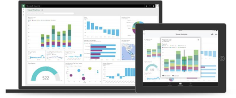
The Out-of-the-Box color themes allow you to quickly create charts and graphs with consistent and eye-pleasing colors automatically.
RELATED CONTENT: HOW TO TOGGLE POWER BI VISUALS
Easy to use Out-of-the-Box visualizations and Icon Sets let you quickly take data and turn them into easily understood graphs and charts.
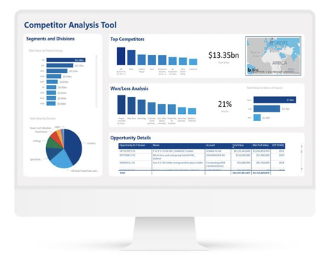
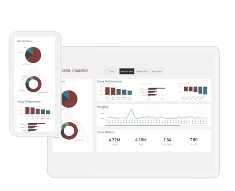
Custom color themes reflecting a companies brand can also be set up easily for all employees to use.
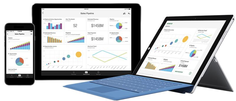
Of course, each Power BI dashboard or report can be viewed on any browser-enabled device perfectly sized and organized for each screen size.
Conclusion
A picture is worth a thousand words, and the same principle applies to Power BI themes.
It puts you in the driver’s seat with an impressive set of data analytics and visualization tools. Your teams will have unified access to company data, data modeling will be sharp and up-to-the-minute, and presentations will be compelling.
Share