
Power BI services give you powerful tools for organizing and presenting data. While Power BI reports can offer your team an in-depth look at the information you’ve collected, sometimes you also need a well-organized overview that can convey the bigger picture at a glance.
You may also want to pull from multiple datasets or reports to provide a meta-analysis. This is where Power BI Dashboards come into play.
What Are Power BI Dashboards?
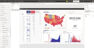
Power BI Dashboards are the easiest way to display essential information from your reports and datasets on a single page. These Dashboards are only included with Power BI services and can only be built on desktop, though they are viewable on mobile devices.
Dashboards can be refreshed to show data in real-time and allow for a customizable view, making it possible for users to pin visuals from different sources onto the same canvas in the form of tiles. A tile can be a graph, visual, or piece of data. They are resizable and moveable, making the process of creating a Dashboard flexible and easy.
What Are Tiles on a Power BI Dashboard?
Before we can dive deeper into the steps of building a dashboard, we need a better understanding of the elements involved, starting with tiles.
Tiles on a Power BI Dashboard serve as a live snapshot of your data that can be sourced from reports, datasets, other dashboards, Excel sheets, and SQL Server Reporting Services. Your Dashboard acts as a canvas for these tiles, letting you tell the story of your data on a single screen.
Building a Power BI Dashboard
Assuming you already have a dataset added, and know how to build a report and visualize your data in Power BI, the process of creating a Dashboard is very simple. The steps below will cover how to create and pin tiles and other features and configuration steps.
Pin Tiles
Once you’ve built your report in Power BI, you can use it as a source for individual visual tiles or the entire Dashboard. Over time, you can make changes to the report that will be reflected in your pinned tiles when you republish it to the Power BI Service.
When you press the pinning icon above the tile you would like to add to your Dashboard, a pop-up window will give you the choice to select an existing Dashboard or create a new one. From there, you can use the simple drag-and-drop interface to manipulate and resize your pin.
Configure Data Alerts
Depending on how you plan to use your Dashboard, this step may not be necessary. However, configuring data alerts can be very helpful for tracking data as it changes and shifts.
You can create an alert so that your team is notified whenever a specific data point is above, below, or at a certain threshold. For example, you may have a sales tracker pinned to the Dashboard that sends you an alert when you’ve reached a specific KPI each month or quarter.
Related Content: How Power BI Reduces Costs for Enterprise
To do this, click on the ellipses (...) in the corner of the tile that you want to set an alert for, and choose, 'Manage Alerts.' Here, you can add an alert rule, which will create the alert.
You can customize your alerts and set the condition, threshold, and frequency of notifications. Make sure to toggle the alert to Active, then save and close to ensure it is applied. Any user with access to the Dashboard will be able to set their own alerts, so team members can personalize alerts for the data that is most relevant to them.
Explore the Q&A Feature
This user-friendly tool in the Power BI Desktop can be found on the top ribbon of your Dashboard. There, you will find a search box labeled “Ask a Question about your Data.” In this question box, any user can enter a question about the Dashboard data in natural language, and Power BI’s natural-language analysis engine will parse the question and answer by displaying the relevant data.
For example, you could ask “What was the average sales amount by category?” and Power BI will present the answer by adjusting the Dashboard’s appearance. The Q&A feature also includes pre-populated suggestion tiles with commonly asked questions. Simply click on this tile to access a visual analysis of the relevant data.
The Q&A feature is a great way for users to explore data in terms they understand, and it allows anyone to parse through the data quickly when seeking a particular answer.
Gain Better Insights with Power BI Dashboards
Dashboards harness Power BI reports and datasets, making them even more accessible and customizable for every team’s needs. With easy organizational tools and tiles that present real-time data cleanly, Dashboards simplify data analysis and presentation. The built-in Q&A tools allow anyone to deep dive into the data simply by asking questions.
A Microsoft consultant can help your team integrate Power BI into your workflow and provide Dashboard training to help you get started with data visualization. Let Power BI Dashboards do the heavy lifting for you—gain better business insights and organize, share, and present your data in a crisp and accessible format that will optimize productivity and planning.
Share