The Unified Interface is meant to provide a consistent, accessible, uniform user interface across devices and across clients. However, whether I am working with the Web/Classic Interface or the Unified Interface, I have always found it clunkier than it needs to be. Why not make the navigation as simple as possible? I don't need all that extra fluff.
The NEW Unified Interface will take a big step forward to try to improve this, and in an upcoming release they will make it even better.
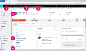
Old Unified Interface
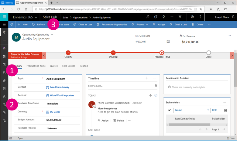
- I have found that this navigation interface is still tricky to navigate - especially when you do not expand the flyout navigation. Even when you do, it is tough to know if there are other tabs.
- Users won't know which icon is which without lots of trial and error.
- The command bar is a single color and it is difficult to tell where one command starts and another ends.
New Unified Interface
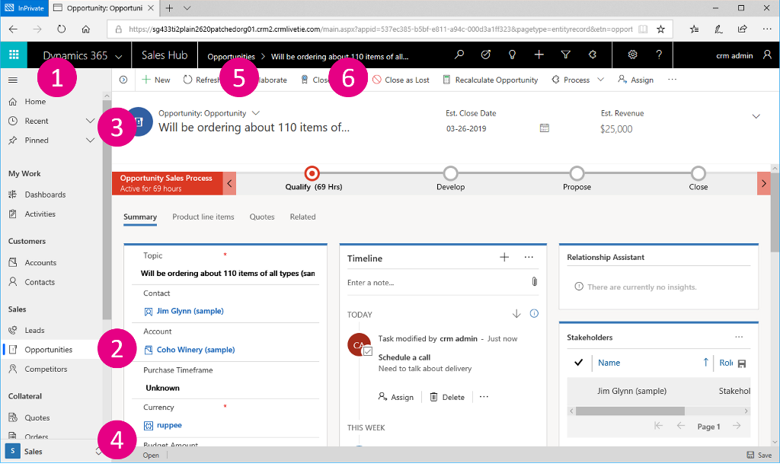
- The navigation flyout will be expanded by default. This will certainly allow users to find what they are looking for much faster and without error.
- The entity you are currently in will be highlighted so that the user doesn't get lost in the system.
- Recent records will show up in the top of the navigation, as well as the ability to pin records.
- The area switcher is at the bottom of the navigation.
- The command bar will highlight which command is selected.
- Colors are added to the command icons.
Overall, it is not perfect but makes navigating the system much easier, for even the most advanced users.
Share